
I’m helping a customer improve their network through better network management visibility into network problems. The result of a proof-of-concept is this graph, which I’ll explain below.

The customer loved the graph because it showed the total number of problems and, more importantly, it showed that the network operations team was steadily addressing the problems. Now let’s take a look at how I created the Network Health Metric chart.
One of the challenges is to help the operations team see what needs to be addressed, prioritize the work, and see their progress against the work load. The work load consists of several components:
- Customer-reported trouble tickets to fix things that don’t work (e.g., slow network performance; problems connecting with a specific application)
- Trouble tickets to implement moves, adds, or changes (e.g., move a phone or a printer; add a video conference system)
- Self-identified network problems — no customer has called, but a network problem was identified by the NMS systems (e.g., interfaces with high error counts; syslog messages reporting significant errors; redundancy failures)
The first two items are pretty easy to track because they are entered into the trouble ticket system. But that’s not necessarily a measure of network health. The first two items typically measure network churn, which is the frequency of customer-reported network problems and the frequency of network changes caused by changes within the organization. A metric that uses these items is really measuring the rate of change, or entropy, of the organization. I had to look at the data that I had available and determine what made sense for measuring network health.
First, it is useful to look at the requirements. I wanted something that showed the network team the overall health of the network and that they were making progress in improving its health. I needed data that could be automatically collected. The resulting output needs to be easy to understand and clearly shows whether the network is improving. It would probably need multiple components and it would be useful for each component’s contribution to be clearly visible. With each component being visible, it would be easy for the network operations team to see the health report change as a result of their efforts, which means that it needed to show the changes in network health over time.
I thought that the requirement for something simple that showed the health over time could be fulfilled with a line graph, updated daily. But what data made sense to display? I could show up to about seven lines on a single graph before it becomes too complex to satisfy my requirement that it be easy to interpret. I started by looking at the things that I know need to be fixed in the network and the sources of that data. I wound up with three initial sources of data for the Network Health Metric.
1) Syslog data are about network events. Some events are critical, such as a power supply failure. Other events are less critical, but important, such as high interface errors or a key interface going down. So it is useful to include only selected critical and important events. For my first analysis, I included important syslog events about CDP Duplex mismatch and high interface errors (Runts, Discards, and Errors are reported by Cisco if they exceed internal thresholds in 30 minutes). I decided that critical syslog events like power supply failures need to be handled separately because they need real-time attention. Ideally, the critical events are handled quickly and never appear in the Network Health Metric.
2) Network analysis data that shows non-impacting failures in redundant systems. These failures are where half of a redundant system has failed. The system continues to operate on the half that is continuing to operate, but is now no longer redundant. The failure of the second half will cause a service outage. Knowing that a system’s redundancy has been compromised allows the network operations team to correct the problem before a system outage occurs. Examples:
- An HSRP group that contains a single router
- Redundant links that have failed, typically router interfaces or switch trunking interfaces
- Configurations that have not been saved
3) Interfaces with more than 100,000 errors or discards per day. Since there are 86,400 seconds in a day, this is roughly equivalent to one error per second. In practice, since most network traffic is during either production or backup hours, the errors tend to occur along with data bursts, seriously impacting application performance. Identifying and correcting the sources of errors makes the network and applications operate more efficiently, increasing the productivity of the organization and its business operations. That translates into more net income and a successful business.
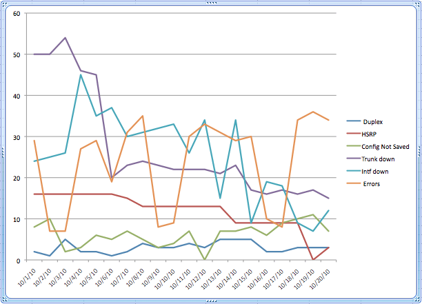
I did the proof of concept chart by using a script to collect the syslog data and manually collecting data from NetMRI’s analysis. The data went into a spreadsheet for 20 days of the month. I then used the spreadsheet stacked line chart to display and sum the data graphically. The result is the chart that appears above. There are some interesting observations that can be made from the data.
First, the network operations team is addressing the problems, because the total numbers are decreasing. It is a stacked line chart, so the top line is the total number of problems and it is trending downwards.
Second, the Errors line shows a clear weekly cycle, which is much more obvious in the Error line of the non-stacked chart:
 Third, as the network operations team reduces these common problems to zero, we will be able to add other sources of network problems without cluttering the chart to the point that it is unusable.
-Terry
_____________________________________________________________________________________________
Re-posted with Permission
NetCraftsmen would like to acknowledge Infoblox for their permission to re-post this article which originally appeared in the Applied Infrastructure blog under http://www.infoblox.com/en/communities/blogs.html
![]()